
I put together two directions for a faster, simpler Sardis Chiropractic site. Both use your own team and clinic photos, keep online booking one tap away, and make fees, conditions and first-visit details easy to find.
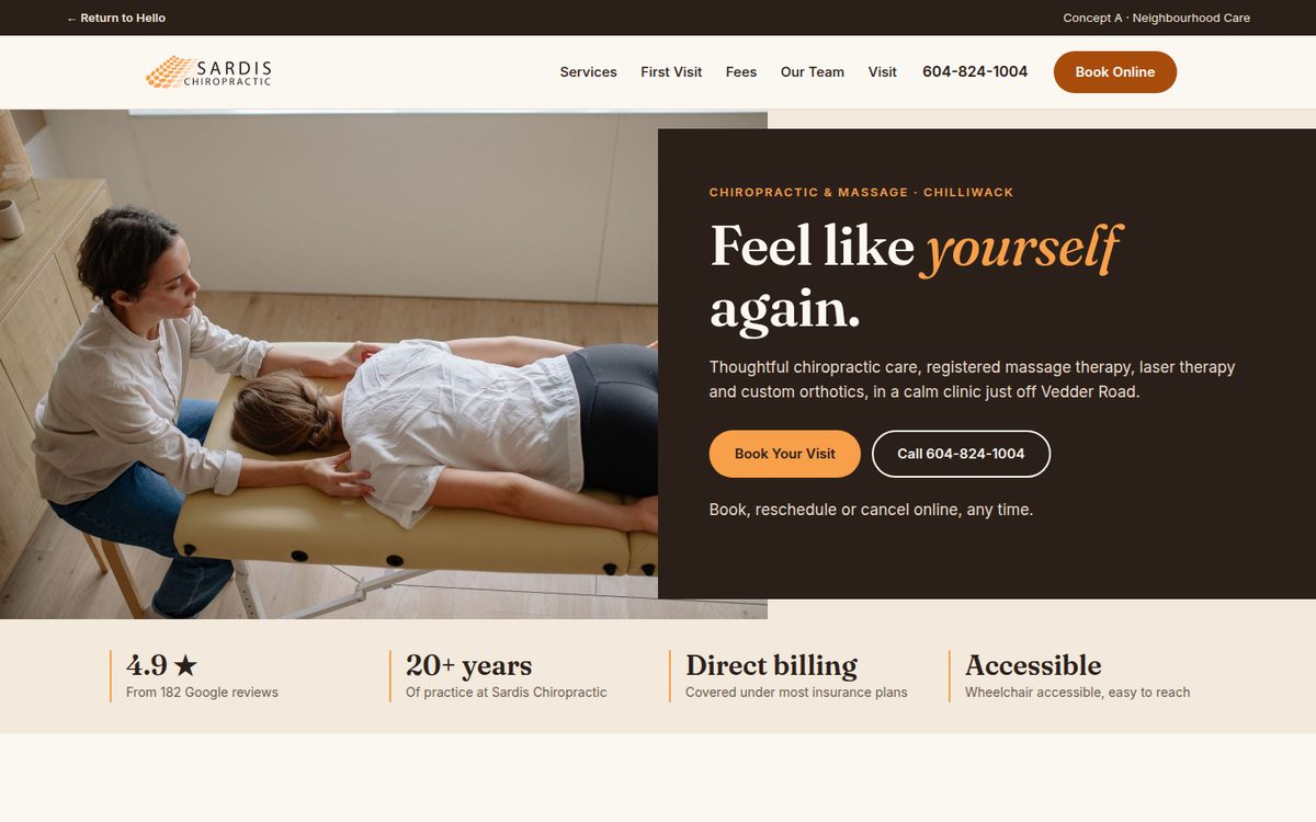
Warm, welcoming and personal. Soft paper tones and your signature orange, with a friendly serif headline and a calm, step-by-step first visit.
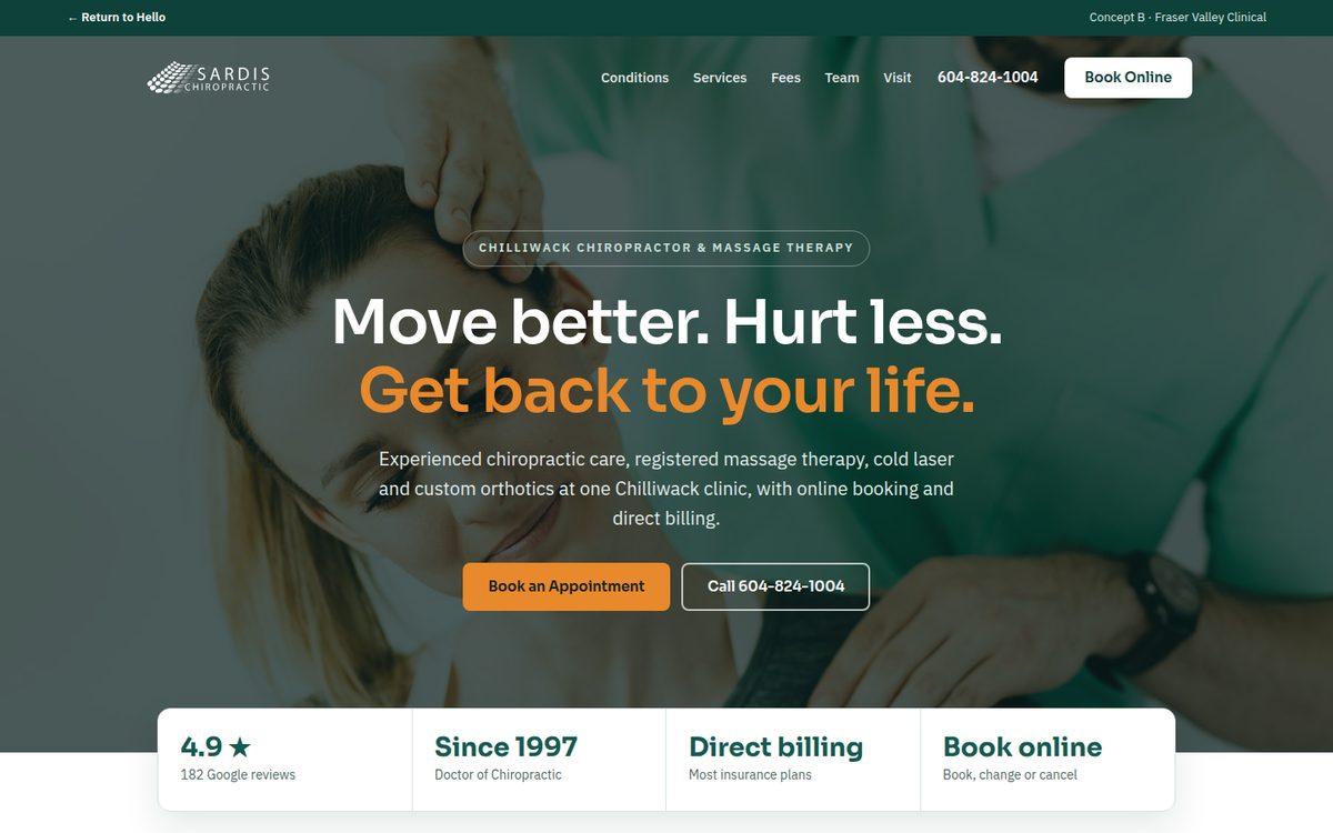
Clean, confident and clinical. Deep green with an orange accent, a bold full-width hero, a quick condition finder and a clear fee list.
Take a look through the concepts to see a few possibilities for your website. Explore them on desktop or mobile to get a feel for each direction.
You’re not limited to the styles shown here. We’re happy to explore other directions and tailor the design around your business, audience, and goals.
Have a question or an idea you’d like to discuss? Reply to the person who shared this page. No need to choose a design; we’d simply like to hear what you have in mind.
Your website should do more than look good. It should help the right people find you, understand what you offer, and take the next step. With 20 years of web design and digital marketing experience, ClickMonster brings design, search visibility, and ongoing support together to help your business move forward.